A Lot of Moving Parts
A research and design studio that creates interactive spatial visualizations of complex systems.
Information
Contact
400 3rd Ave, Ste. 2
Brooklyn, NY 11215
T +1 (415) 416 9207
hello@alotofmoving.parts
About
A Lot of Moving Parts produces 3D experiences for artists, architects, publications, and cultural institutions using research and computational technologies. We deploy spatial representation, data visualization, and software design as a form of critical practice. The studio is led by Seth Thompson.
We are interested in producing new ways of seeing the built environment and new interfaces for displaying spatial data, as instruments for understanding the complexity of the world around us. Our point of departure is the history of the technical image and the ongoing entanglement between our ability to depict space and our capacity to conceptualize it. Tying together these concerns is a belief that the ultimate test of a visualization is its ability to communicate an idea simply and effectively to a broad public audience.
Our process is iterative, collaborative, and occasionally experimental as we navigate the unique demands of each project’s source material. We work with collaborators as full creative partners, beginning our involvement as early in the project lifecycle as possible. Depending on the scale of the project or the expertises required, the studio draws on the support of a network of independent practitioners. From our vantage point, every project of sufficient depth necessarily has a lot of moving parts.
Contact
400 3rd Ave, Ste. 2
Brooklyn, NY 11215
T +1 (415) 416 9207
hello@alotofmoving.parts
About
A Lot of Moving Parts produces 3D experiences for artists, architects, publications, and cultural institutions using research and computational technologies. We deploy spatial representation, data visualization, and software design as a form of critical practice. The studio is led by Seth Thompson.
Collaborators
New York Review of Architecture, Utah Museum of Contemporary Art, City of Alexandria Office of the Arts, Yale School of Architecture, Pratt Institute School of Architecture, Prada, Mercedes Benz R&D, Sosolimited, SOFTlab, Bocoup, Theo Anthony, MEMORY, Michael Jones McKean Studio
Services
Interactive Spatial Design, 3D Rendering, Software Development, Web Development, Geospatial Research, Data Visualization, Film
We are interested in producing new ways of seeing the built environment and new interfaces for displaying spatial data, as instruments for understanding the complexity of the world around us. Our point of departure is the history of the technical image and the ongoing entanglement between our ability to depict space and our capacity to conceptualize it. Tying together these concerns is a belief that the ultimate test of a visualization is its ability to communicate an idea simply and effectively to a broad public audience.
Our process is iterative, collaborative, and occasionally experimental as we navigate the unique demands of each project’s source material. We work with collaborators as full creative partners, beginning our involvement as early in the project lifecycle as possible. Depending on the scale of the project or the expertises required, the studio draws on the support of a network of independent practitioners. From our vantage point, every project of sufficient depth necessarily involves a lot of moving parts.
Twelve Earths
Details
Michael Jones McKean & Fathomers
Apr 2023 –
With Michael Jones McKean Studio, agustine zegers, and Alex Goss
Website
Twelve Earths is a planetary sculpture initiated by Michael Jones McKean that connects 12 locations around the globe along a single “great circle.” We designed an interactive website to document these locations and their interconnected ideas and objects.
Details
Michael Jones McKean & Fathomers
Apr 2023 –
With Michael Jones McKean Studio, agustine zegers, and Alex Goss
Website
Twelve Earths is a planetary sculpture initiated by Michael Jones McKean that connects 12 locations around the globe along a single “great circle,” including a cluster of astronomical observatories in Chile and a Paleolithic archaeological site in Portugal.
We designed an interactive website to document these locations and their interconnected ideas and objects, using a wide array of methods including photogrammetry, GIS research, astronomical data analysis, and archaeological stratigraphy.
Process
Terrain

In rendering the natural terrain around each Twelve Earths site, we used two types of geospatial data: a digital elevation model (or DEM) and a satellite base map. The elevation model encodes the elevation of a given point on the Earth’s surface as a high-bit-depth grayscale value. Using pydelatin, we turned the elevation data into triangulated mesh. Then we textured the mesh with a 0.25m orthorectified satellite map from the Portuguese National Register for Geographic Information (SNIG).
Process
Terrain

In rendering the natural terrain around each Twelve Earths site, we used two types of geospatial data: a digital elevation model (or DEM) and a satellite base map. The elevation model encodes the elevation of a given point on the Earth’s surface as a high-bit-depth grayscale value. Using pydelatin, we turned the elevation data into triangulated mesh. Then we textured the mesh with a 0.25m orthorectified satellite map from the Portuguese National Register for Geographic Information (SNIG) data portal.
In order to add more detail to the surface of the terrain mesh, we built a procedural building generator in Blender that extruded single and double-story vernacular housing based on building footprints from the Bing Maps Global ML Building Footprints repository. We combined the terrain mesh and building geometry into a set of GLTF tiles covering 300 sq. km of terrain around the site. Although the final output was a video, we used three.js to compose the scene.
Process
Terrain

In rendering the natural terrain around each Twelve Earths site, we used two types of geospatial data: a digital elevation model (or DEM) and a satellite base map. The elevation model encodes the elevation of a given point on the Earth’s surface as a high-bit-depth grayscale value. Using pydelatin, we turned the elevation data into triangulated mesh. Then we textured the mesh with a 0.25m orthorectified satellite map from the Portuguese National Register for Geographic Information (SNIG) data portal.
In order to add more detail to the surface of the terrain mesh, we built a procedural building generator in Blender that extruded single and double-story vernacular housing based on building footprints from the Bing Maps Global ML Building Footprints repository. We combined the terrain mesh and building geometry into a set of GLTF tiles covering 300 sq. km of terrain around the site. Although the final output was a video, we used three.js to compose the scene.
In three.js, we added colored directional lighting to match the direction and temperature of the sunlight in the underlying satellite imagery, atmospheric fog, and an abstract glowing ring to represent the “great circle” that connects all Twelve Earths sites. We added curvature to the scene and built a camera rig to keep the camera equidistant from the surface of the terrain model as it followed the path of the ring. The final video was exported with ccapture.js at 4K 60fps with motion blur.
Process
Terrain

In rendering the natural terrain around each Twelve Earths site, we used two types of geospatial data: a digital elevation model (or DEM) and a satellite base map. The elevation model encodes the elevation of a given point on the Earth’s surface as a high-bit-depth grayscale value. Using pydelatin, we turned the elevation data into triangulated mesh. Then we textured the mesh with a 0.25m ortho-rectified satellite map from the Portuguese National Register for Geographic Information (SNIG) data portal.
In order to add more detail to the surface of the terrain mesh, we built a procedural building generator in Blender that extruded single and double-story vernacular housing based on building footprints from the Bing Maps Global ML Building Footprints repository. We combined the terrain mesh and building geometry into a set of GLTF tiles covering 300 sq. km of terrain around the site. Although the final output was a video, we used three.js to compose the scene to allow for future rendering on the web.
In three.js, we added colored directional lighting to match the direction and temperature of the sunlight in the underlying satellite imagery, atmospheric fog, and an abstract glowing ring to represent the “great circle” that connects all Twelve Earths sites. We added curvature to the scene and built a camera rig to keep the camera equidistant from the surface of the terrain model as it followed the path of the ring. The final video was exported with ccapture.js at 4K 60fps with motion blur.
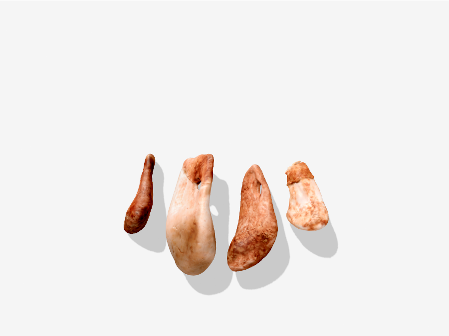
Red Deer Canines Four red deer canines with perforations were found near the Lapedo child, suggesting that they may have been strung together as pendants in a burial headdress
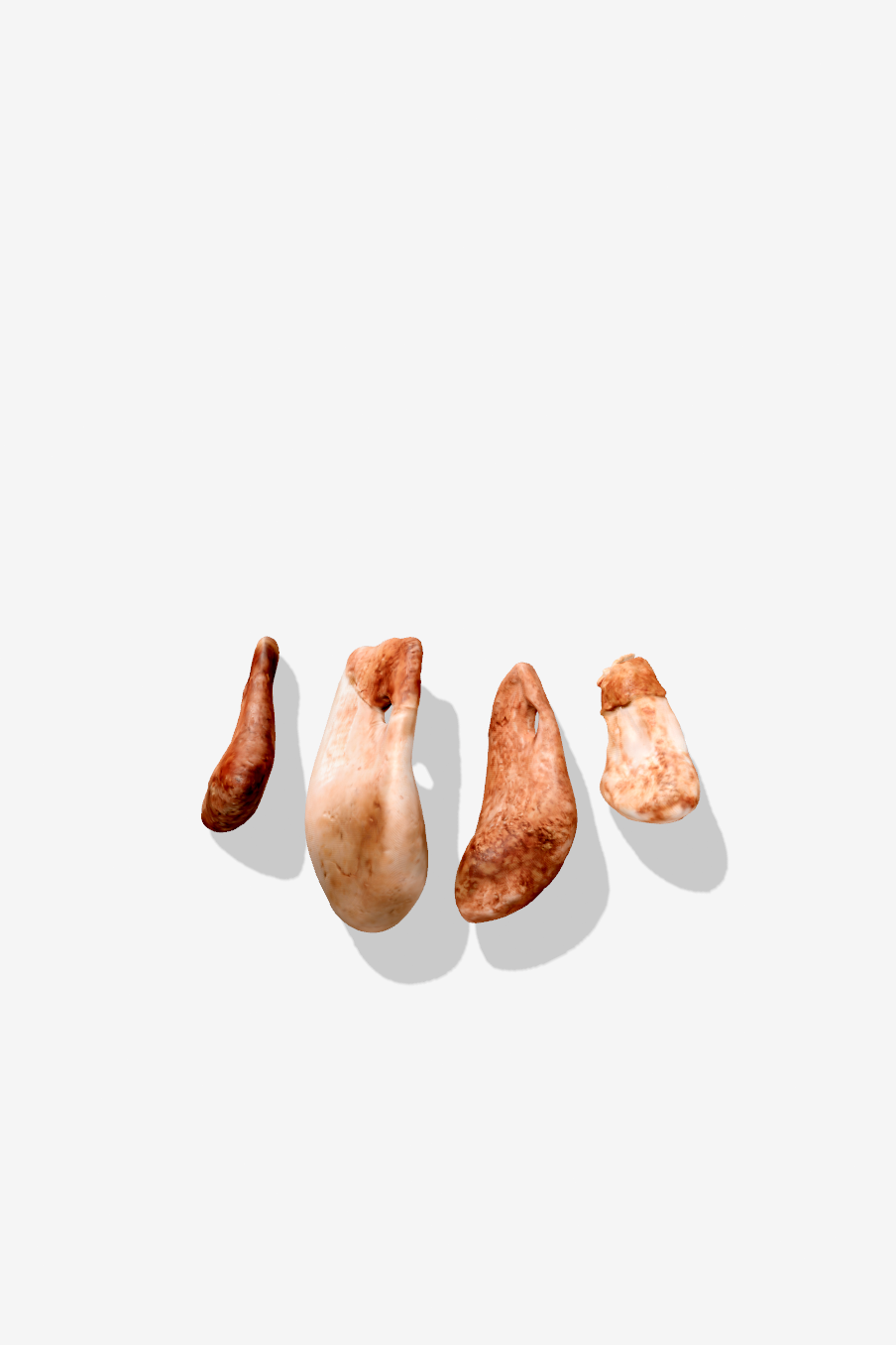
Red Deer Canines Four red deer canines with perforations were found near the Lapedo child, suggesting that they may have been strung together as pendants in a burial headdress
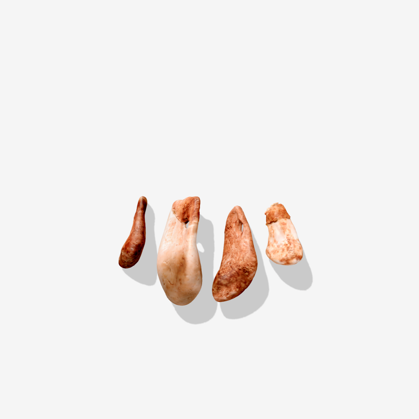
Red Deer Canines Four red deer canines with perforations were found near the Lapedo child, suggesting that they may have been strung together as pendants in a burial headdress
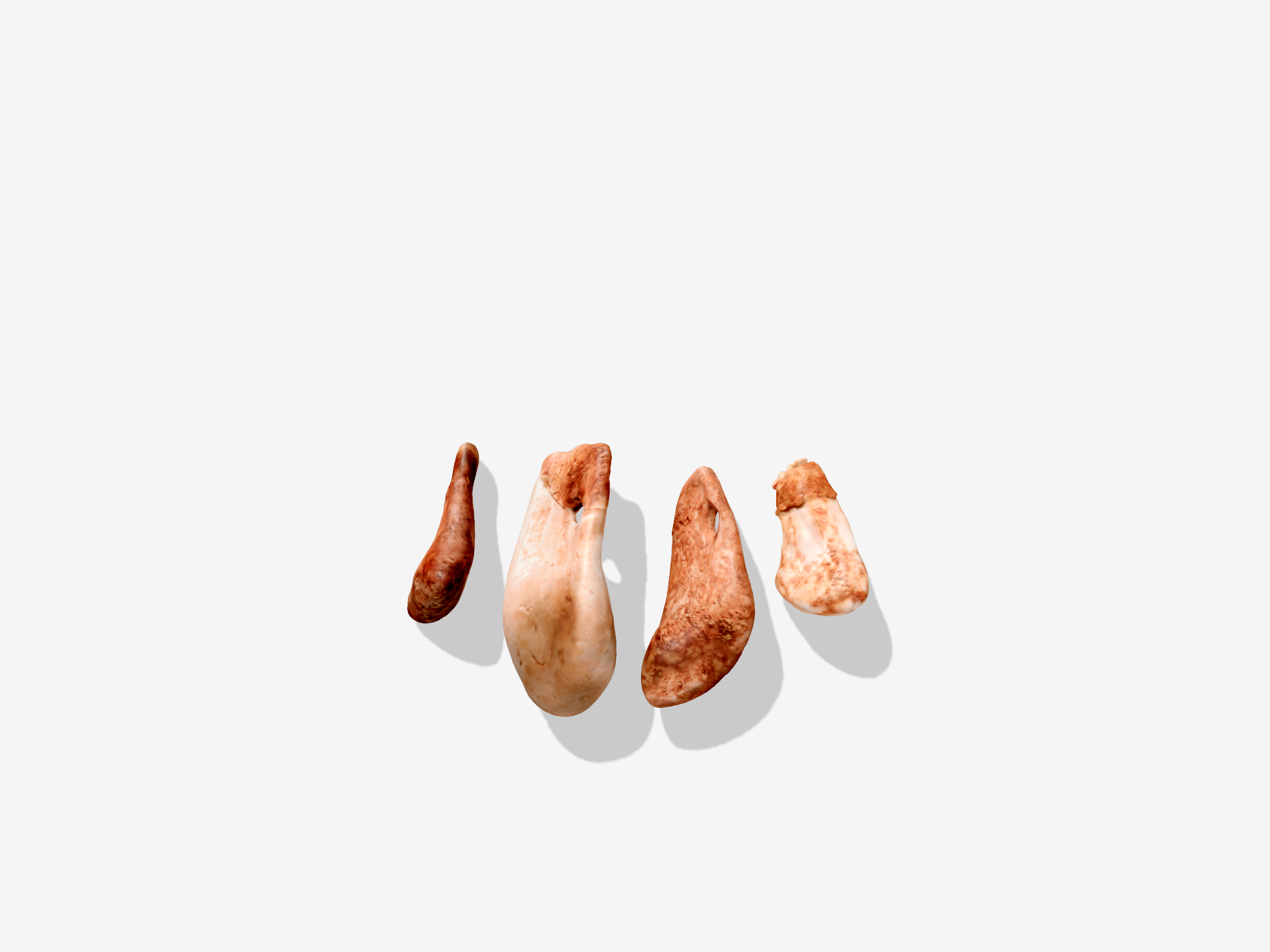
Red Deer Canines Four red deer canines with perforations were found near the Lapedo child, suggesting that they may have been strung together as pendants in a burial headdress
Paprika!
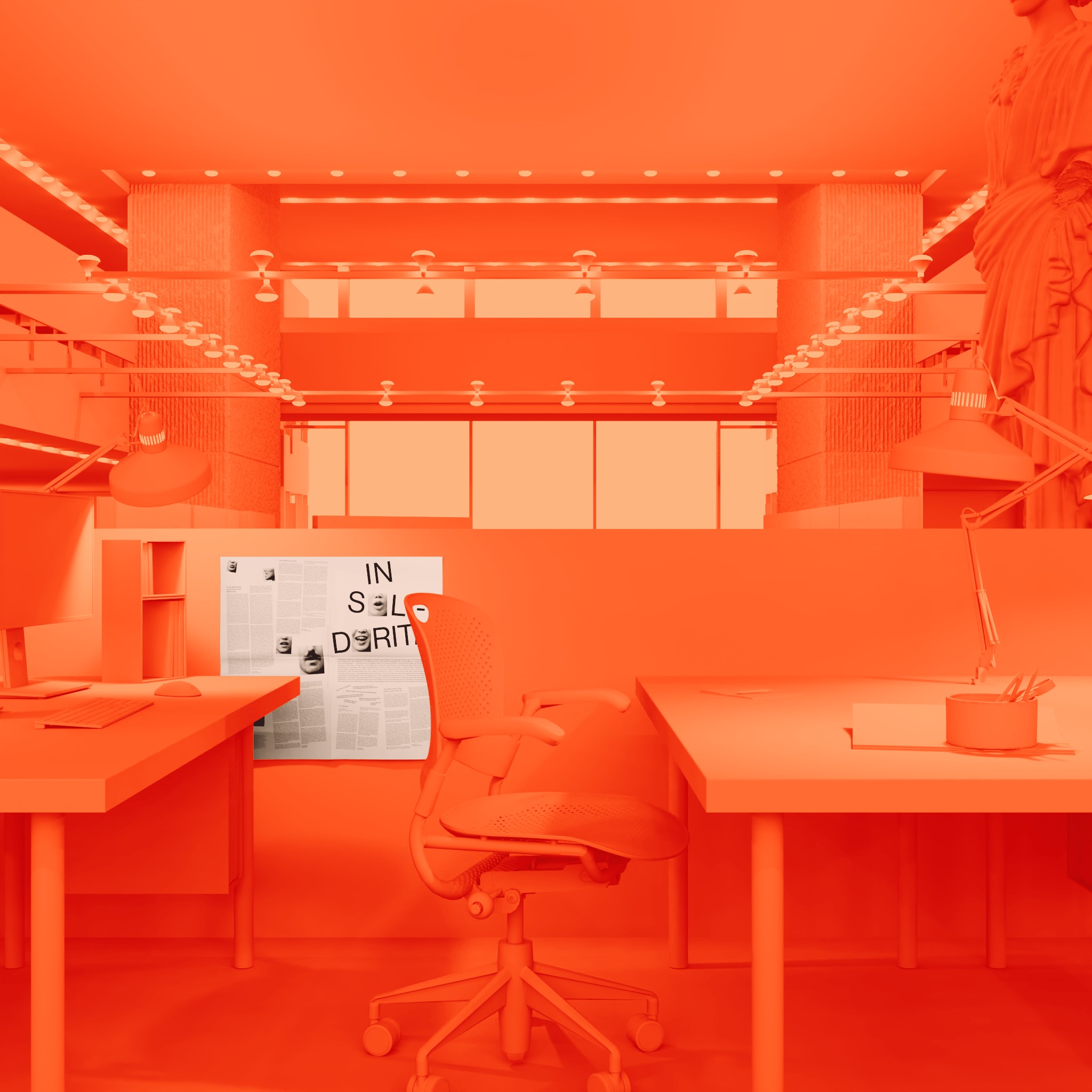
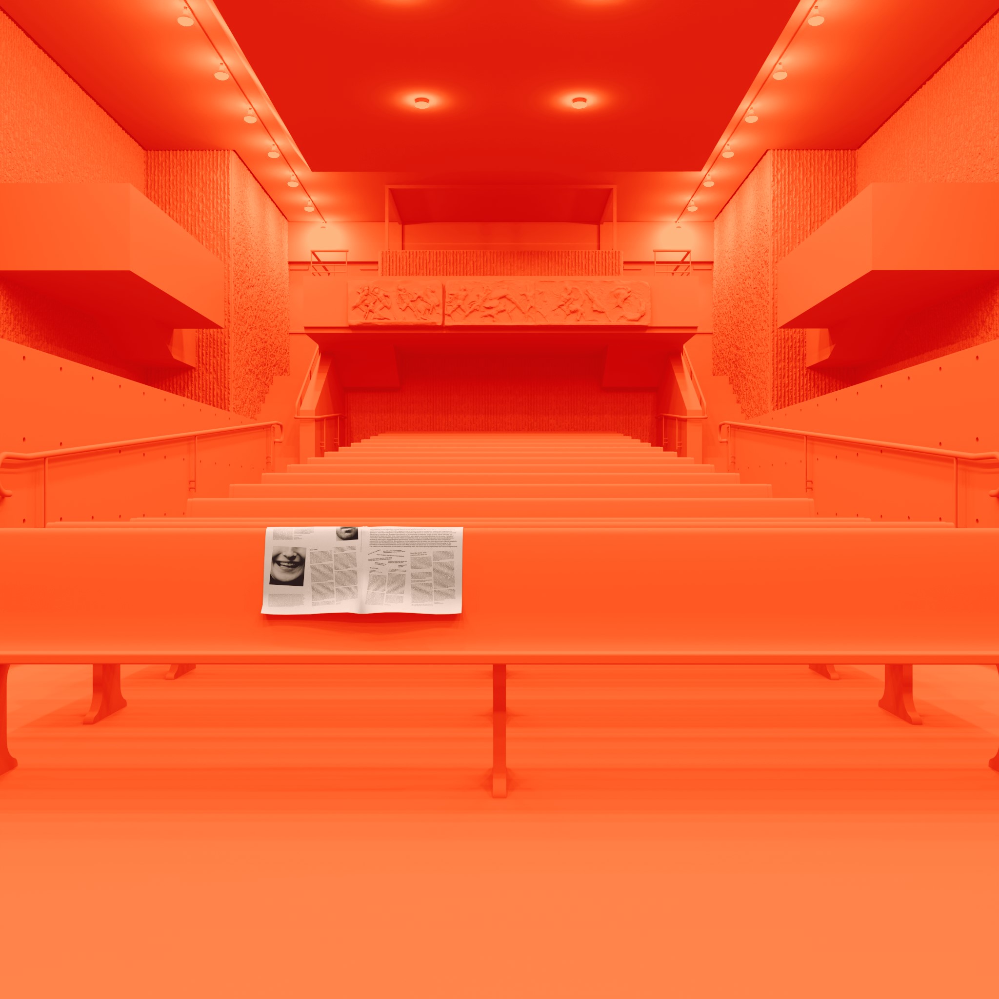
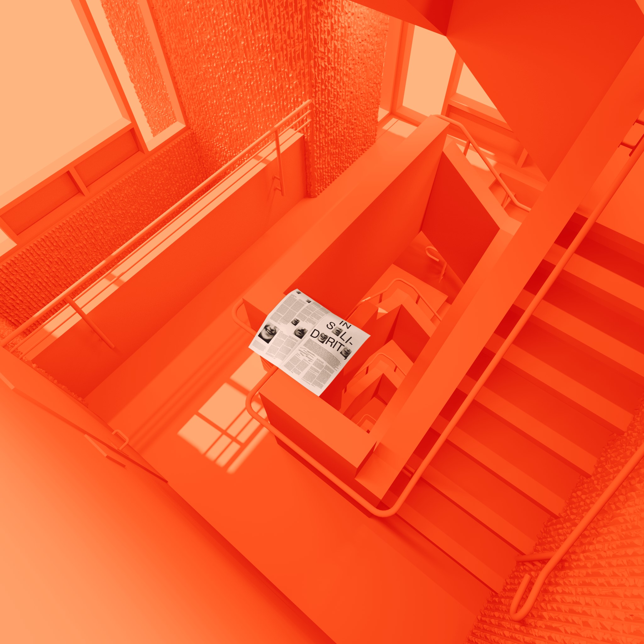
Paprika! is the often-monthly broadsheet published by the students of the Yale School of Architecture and Yale School of Art. We depicted each new issue in its natural habitat scattered around Rudolph Hall in a series of vibrant paprika-orange renderings.
Details
Paprika! Journal
Jan 2020 – Apr 2022
Website
Paprika! is the often-monthly broadsheet published by the students of the Yale School of Architecture and Yale School of Art. Errant issues are often found scattered around Rudolph Hall.
We modeled the entire seven-story building and populated each scene with details from reference images in order to depict each new issue in its natural habitat in a series of vibrant paprika-orange renderings.
Process
UV Compositing
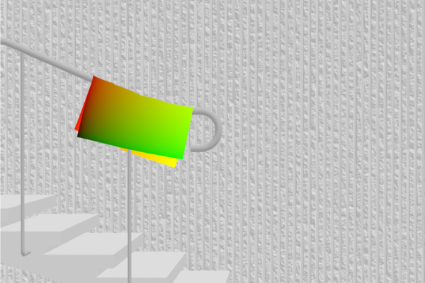
The Rudolph Hall renders are fully dynamic: when a new publication is uploaded to the Kirby CMS backend, a new render is generated instantly, on the server. To achieve this dynamic behavior, we extended the CMS thumbnail system to orchestrate a multi-layer compositing operation with ImageMagick, an open-source CLI tool for converting, resizing, and editing raster images (conveniently installed by default on most web servers).
Process
UV Compositing

The Rudolph Hall renders are fully dynamic: when a new publication is uploaded to the Kirby CMS backend, a new render is generated instantly, on the server. To achieve this dynamic behavior, we extended the CMS thumbnail system to orchestrate a multi-layer compositing operation with ImageMagick, an open-source CLI tool for converting, resizing, and editing raster images (conveniently installed by default on most web servers).
The script requires as input: a background rendering, a special UV map showing the perspectival projection of the newspaper in the rendering, a mask for foreground objects (all created previously, offline), and the front and back images of the publication (editable dynamically in the CMS). Using ImageMagick’s Composite and Distort operations these layers are merged one-by-one into a single output image at runtime.
Process
UV Compositing

The Rudolph Hall renders are fully dynamic: when a new publication is uploaded to the Kirby CMS backend, a new render is generated instantly, on the server. To achieve this dynamic behavior, we extended the CMS thumbnail system to orchestrate a multi-layer compositing operation with ImageMagick, an open-source CLI tool for converting, resizing, and editing raster images (conveniently installed by default on most web servers).
The script requires as input: a background rendering, a special UV map showing the perspectival projection of the newspaper in the rendering, a mask for foreground objects (all created previously, offline), and the front and back images of the publication (editable dynamically in the CMS). Using ImageMagick’s Composite and Distort operations these layers are merged one-by-one into a single output image at runtime.
The final image is cached on disk so that subsequent requests can serve the image immediately. When any of the underlying input assets change, or a new image for the publication is uploaded, the cache entry is evicted and a new one is generated at the time for the next request. Compared to realtime rendering with WebGL, this system allows for greater graphic realism with no runtime performance cost while maintaining dynamic editability.
Process
UV Compositing

The Rudolph Hall renders are fully dynamic: when a new publication is uploaded to the Kirby CMS backend, a new render is generated instantly, on the server. To achieve this dynamic behavior, we extended the CMS thumbnail system to orchestrate a multi-layer compositing operation with ImageMagick, an open-source CLI tool for converting, resizing, and editing raster images (conveniently installed by default on most web servers).
The script requires as input: a background rendering, a special UV map showing the perspectival projection of the newspaper in the rendering, a mask for foreground objects (all created previously, offline), and the front and back images of the publication (editable dynamically in the CMS). Using ImageMagick’s Composite and Distort operations these layers are merged one-by-one into a single output image at runtime.
The final image is cached on disk so that subsequent requests can serve the image immediately. When any of the underlying input assets change, or a new image for the publication is uploaded, the cache entry is evicted and a new one is generated at the time for the next request. Compared to realtime rendering with WebGL, this system allows for greater graphic realism with no runtime performance cost while maintaining dynamic editability.
All Light, Expanded
Details
Theo Anthony & MEMORY
Jul 2021 – Dec 2021
With Bhavik Singh, supported by Theo Anthony, Riel Roch-Decter, Sebastian Pardo, and Jonna McKone
Website
All Light, Expanded is an interactive online companion to Theo Anthony’s award-winning film “All Light, Everywhere.” We created a custom interface that allows users to scrub through the film and uncover connections, research and ideas that inspired the documentary.
We worked across multiple dimensions—temporal, spatial, conceptual and relational—to organize and display 400 references, including archival images, videos, notes, and research citations.
Interactive Companion The website allows visitors to scrub to a point in the film, read corresponding entries, explore related references, trace a path through the constellation of ideas, and discover external sources to explore further
Interactive Companion The website allows visitors to scrub to a point in the film, read corresponding entries, explore related references, trace a path through the constellation of ideas, and discover external sources to explore further
Interactive Companion The website allows visitors to scrub to a point in the film, read corresponding entries, explore related references, trace a path through the constellation of ideas, and discover external sources to explore further
Interactive Companion The website allows visitors to scrub to a point in the film, read corresponding entries, explore related references, trace a path through the constellation of ideas, and discover external sources to explore further
Garden—Pleasure
Details
Yale School of Architecture
Aug 2019 – Feb 2020
With And Or Forever, supported by Daniel Glick-Unterman, Ian Donaldson, and Carr Chadwick
Website
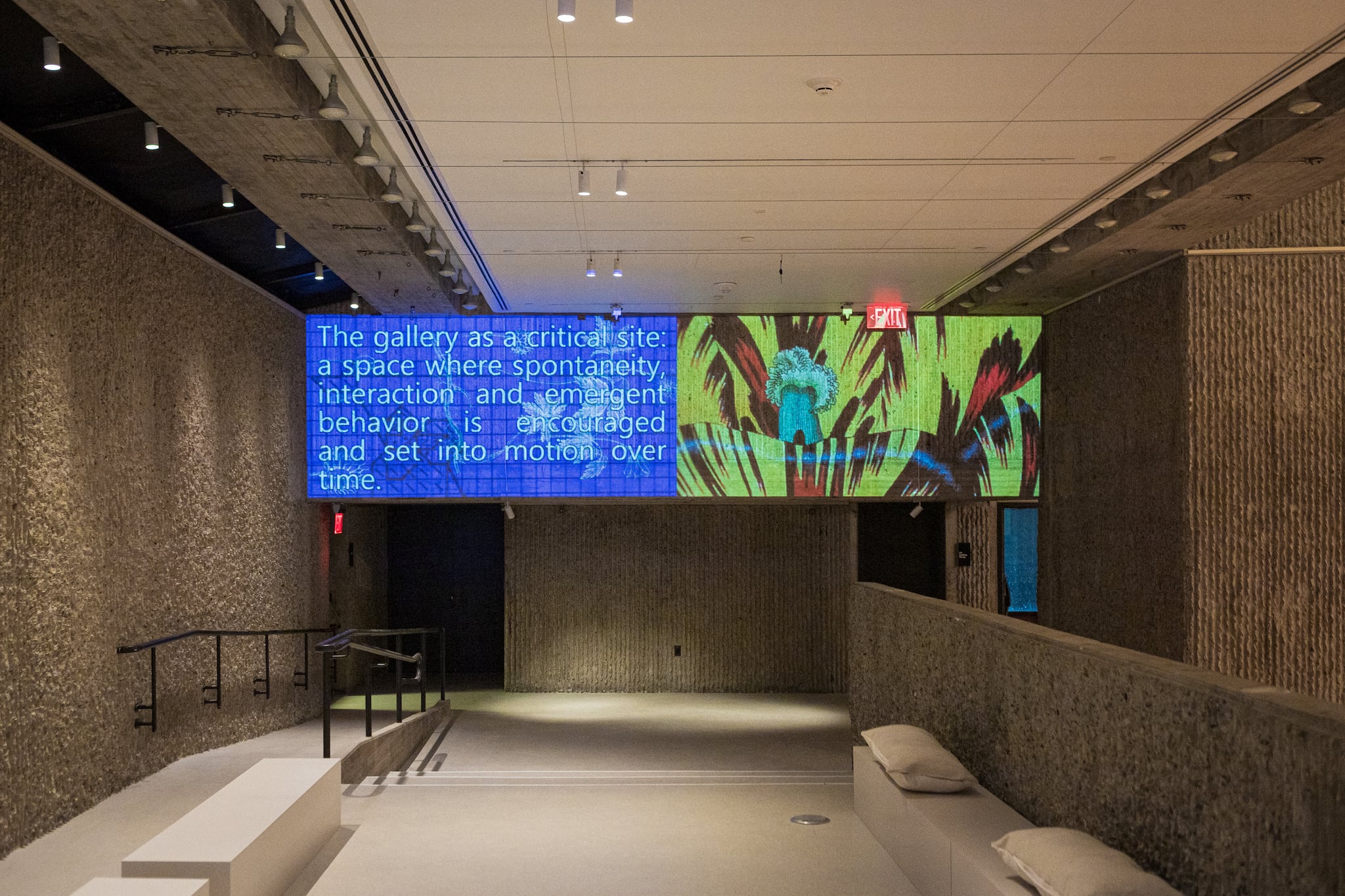
The Garden—Pleasure exhibition at the Yale School of Architecture hosted community art installations, events, and performances. Four projectors mirrored pages from a live website, with aspect ratios to match the gallery walls.
Details
Yale School of Architecture
Aug 2019 – Feb 2020
With And Or Forever, supported by Daniel Glick-Unterman, Ian Donaldson, and Carr Chadwick
Website
The Garden—Pleasure exhibition at the Yale School of Architecture gathered a rotating cast of artists, students, educators, and community members to attend and host art installations, events, and performances that spanned the duration of the show.
Four projectors mirrored pages from a live website, with aspect ratios to match the gallery walls. The reciprocal relationship between architecture and website mirrored that of the show and its community collaborators.
Process
Calibration

Each of the projected digital signs covered a gallery wall edge-to-edge and displayed the contents of a live page from the exhibition website. The walls varied drastically in size and aspect ratio, including the long wall depicted above (23 ft wide and 5.5 ft tall). In order to align projected image and wall, we created a CSS checkerboard pattern on the exhibition website.
Process
Calibration

Each of the projected digital signs covered a gallery wall edge-to-edge and displayed the contents of a live page from the exhibition website. The walls varied drastically in size and aspect ratio, including the long wall depicted above (23 ft wide and 5.5 ft tall). In order to align projected image and wall, we created a CSS checkerboard pattern on the exhibition website.
Using the checkerboard pattern for reference, we adjusted the position, focus, and keystone correction of each projector. In order to “crop” the projected image to the correct aspect ratio, we displayed a black background outside of the target area on the corresponding web page. This area of the projected image was invisible in the ambient lighting conditions of the gallery.
Process
Calibration

Each of the projected digital signs covered a gallery wall edge-to-edge and displayed the contents of a live page from the exhibition website. The walls varied drastically in size and aspect ratio, including the long wall depicted above (23 ft wide and 5.5 ft tall). In order to align projected image and wall, we created a CSS checkerboard pattern on the exhibition website.
Using the checkerboard pattern for reference, we adjusted the position, focus, and keystone correction of each projector. In order to “crop” the projected image to the correct aspect ratio, we displayed a black background outside of the target area on the corresponding web page. This area of the projected image was invisible in the ambient lighting conditions of the gallery.
The final version of the website retained the unique aspect ratios of the gallery walls. In this manner, online visitors to the web page were exposed to the compositional logic of the architecture in the gallery. Over the course of the exhibition, we used the ease of updating the website CMS to ensure the signage in the gallery continually adapted to the programming.
Process
Calibration

Each of the projected digital signs covered a gallery wall edge-to-edge and displayed the contents of a live page from the exhibition website. The walls varied drastically in size and aspect ratio, including the long wall depicted above (23 ft wide and 5.5 ft tall). In order to align projected image and wall, we created a CSS checkerboard pattern on the exhibition website.
Using the checkerboard pattern for reference, we adjusted the position, focus, and keystone correction of each projector. In order to “crop” the projected image to the correct aspect ratio, we displayed a black background outside of the target area on the corresponding web page. This area of the projected image was invisible in the ambient lighting conditions of the gallery.
The final version of the website retained the unique aspect ratios of the gallery walls. In this manner, online visitors to the web page were exposed to the compositional logic of the architecture in the gallery. Over the course of the exhibition, we used the ease of updating the website CMS to ensure the signage in the gallery continually adapted to the programming.
Flood
Events
Emergence
Low Tide
Flood
1280px × 790px
34:21 aspect ratio
Epson Powerlite 485W
3,100 lumens
Events
1920px × 1080px
16:9 aspect ratio
Epson Powerlite Pro
G5450WUNL
4,000 lumens
Emergence
1920px × 480px
4:1 aspect ratio
Epson Powerlite Pro
G5450WUNL
4,000 lumens
Low Tide
1200px × 1666px
18:25 aspect ratio
Epson Powerlite Pro
G5450WUNL
4,000 lumens
A Lot of Moving Parts
A research and design studio that creates interactive spatial visualizations of complex systems.
